June 2024
Regents University London
Role
UX Designer and Researcher
Duration
13 Weeks
Tools
Figma, Qualtrics, Miro

June 2024
Optimising the Regents University Mobile App to Enhance Student Engagement, Satisfaction and Overall Student Experience
Despite the app's launch in 2022, engagement levels were low, raising concerns about its effectiveness.
Client Context
The university’s app aimed to centralise access to academic schedules, administrative resources, and community tools, yet students reported difficulties in finding relevant information, navigating the app, and using its core features effectively.
Solution Summary
The optimised app introduced significant changes to its information architecture and feature set:
🧭 A streamlined navigation system tailored to both undergraduate and postgraduate needs.
🌟 New features, including an academic dashboard, community-building tools, and personalised notifications.
🎨 Visually appealing and accessible design principles to create a seamless user experience. The redesign prioritized user-centered design to align with student expectations and institutional goals.

Before

After
Overview of Sections
Case Study Files and Links
Context
In 2021 Regents found that students
Had difficulty finding information due to too many systems and platforms.
Missing out on information about events.
Inefficient communication methods with overload of emails
Their solution
To launch a platform and app which links all the different student platforms available in one place (The intranet). The role of the app was to be a central communication hub giving students convenient mobile access to important information, including a link to the intranet.
Problem statement
The Regents University's new app suffered from low engagement due to issues such as unreliable navigation, lack of timely information, and missing features. These challenges hindered students from fully utilising the app to support their academic and social needs, impacting their overall university experience.

Project Aim
To bridge the gap between student expectations and their experiences using the app. The focus is:


Research
Main Research Question
What factors of the Regents University app effect Student engagement, satisfaction, and overall experience? how can the app be optimised to better serve those aspects?
Goals
1. Address key drivers and barriers to app usage
2. Assess the app’s impact on engagement and satisfaction
3. Assess the app’s role and design in overall student experience.
Methodology
36 students
Provides understanding on usage patterns, satisfaction levels, and desired features.
6 students
Deeper insights on the “Why” and “How” factors to questionnaire data
to uncover deeper insights into their experiences and expectations.
4 students
Test and validate solutions, gather insights and refine designs.

Gantt Chart
Success to any project starts by having a clear timeline of what needs to be done by when. Considering we had 3 months it was important to plan efficiently and stick to the plan.

Empathising
The empathise phase centred around gaining a deep understanding of users’ experiences and motivations through direct interaction and observation. Focus was on understanding student needs and challenges. Activities involved include:
Data Analysis of questionnaires and interviews
User Personas
User Journey Maps
Key insights

More interested in community-related features and engagement opportunities.
Generally more satisfied with the app, using the app frequently, 2- 3 times a week.
Want easier access to event information, social activities, and features for connecting with peers.

More concerned with accessing academic information.
Generally lower satisfaction with the app due to missing or outdated academic information.
Want better integration with academic support services, reliable updates on grades, and the ability to manage tasks efficiently.
Key Themes
Timeliness, Relevance, and Clarity of Information
The app struggles with outdated or missing critical information, delayed notifications, and unclear information display.


Ease of Use
Users find the navigation and layout confusing, difficult information retrieval, and recurring technical problems that affect usability.


Desired Functionalities
Students suggested better community-building features, better integration with other platforms, and improved booking functionalities.


Defining
Insights were analysed to identify and focus on core problems. Problems are addressed based on effectiveness of solution and constraints to time and technical knowledge. Activities involved include:
Priority Matrix
Problem Statements
User Stories

To see more on how definition phase came to be visit my Miro Board .
Problem Statements
Problem Statement 1
Students struggle with navigating the app due to poor design and information architecture, leading to difficulties in finding important information.

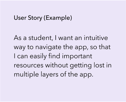
Problem Statement 2
The app lacks clear and relevant academic and social information, resulting in difficulties for students to efficiently access and understand critical updates, schedules, and event information.


Ideating
Generate numerous ideas to address problems identified. Ensures that the solutions are both innovative and aligned with user needs and priorities. Activities involved include:
How Might We Questions
Brain Storming
Site Mapping

Wireframing and Lo-fi Prototyping
Creating visual representations of the ideas generated to evaluate the quality and feasibility of proposed solutions, ensuring they align with business objectives and effectively address user needs.


Hi-fi Prototypes
Navigation and Home Page

Primary and secondary navigation bars for easier access to essential and context specific information
Relevant and important information at a glance. Address the needs of students who want to find relevant and important information immediately.
Customisable shortcuts to allow students to quickly access their most-used features.
Academics and Visual Design

Clear need to easily access academic information.
GESTALT principles of similarity and proximity to grouping related information together.
Charts, progress bars, and colour to condition users to process information quickly and effectively, reducing cognitive load.
Events and Communities

Easily access and registration to social groups and activities, improving and promoting community building.
Showing students who else is part of events and societies as social proof, incentivising them to want to join.
Using Hick’s law, minimising the number of choices available on the screens to reduce cognitive load
Notification and Explore

Introduced persistent time-sensitive notifications to ensure students receive important updates promptly.
Organised notifications by relevance to help students prioritise information.
Search function with recommendations of frequently asked questions to anticipate student needs.
Testing
For the final part of the UX development process and phase 2 of the data collection, we conducted usability tests with a sample of four students to validate the prototype. We gave users 6 tasks, all of which were related to barriers and drivers found during the research, emulating how students would use the app in real life.
Testing Results
90% of participants completed tasks without assistance, highlighting improved usability.
Positive feedback on the academic dashboard and personalised notifications.
Positive feedback on the ability to see events happening directly in the app.
Minor confusion on items located in the explore page.
Key Insights
Due to time constraints it was not possible to iterate on the final prototype. But some examples of iterations that could be done are:
Refine notification hierarchy to prioritise important academic information for quick and prominent access.
Adjust the labelling of sections and organisation of features to better match user intuitions and expectations
Introduce progressive disclosure of less used features to prevent overwhelming user.
Recommendations

Academic Updates
Implement real-time updates to improve satisfaction and reduce faculty workload.

Navigation Challenges
Further enhance navigation to reduce cognitive load and improve retention.

Technical Reliability
Introduce Single Sign-On (SSO) for better user experience and data security.

Personalisation & Autonomy
Enhance personalisation features to increase engagement and satisfaction.

Social Integration
Integrate social features to foster a sense of belonging and strengthen the alumni network.

Unified Platform
Centralise all relevant information on one platform to streamline communication and reduce administrative burden.
Contributions

User-Centred Solutions
Demonstrated the value of real-time, personalised notifications for enhancing student engagement and shifting apps from passive to active tools.
Cognitive Load Theory Application
Improved navigation framework that reduces cognitive overload, applicable in other complex information environments (e.g., healthcare, business)

Academic and Social Features
Created a holistic, integrated platform that could redefine personalised learning environments and improve student retention.