May 2021
QUAN WELL-BEING
Role
UX Designer and Researcher
Duration
16 Weeks
Tools
Figma, Adobe XD, Miro, Blush

May 2021
Designing an Intuitive Well-being Platform for Quan
Initially, this Quan project aimed to help users with starting and maintaining well-being habits. However, along the journey with Quan, this aim shifted and became more about providing users with the right tools at the right time to aid their well-being journey in the areas that need it the most.
Client Context
Quan was founded at the beginning of the COVID-19 pandemic, when the world needed a solution that could help people with their well-being. They realised that there is a growing market for preventative wellbeing solutions, and they argue that wellbeing is critical to success and to avoid burnouts.
Solution Summary
A web-platform that provides personalised tools and guidance to help users manage their mental health effectively. By applying design thinking and user-centered research, I created a system that balances simplicity and functionality, allowing users to focus on their personal growth with minimal effort.

Before

After
Overview of Sections
Case Study Files and Links
Context
The existing platform struggled to effectively guide users through long-term behaviour change. While the intention was to support mental health through habit formation, early user engagement revealed deeper challenges in usability, personalisation, and timing of support. This project emerged from a need to critically examine and redesign the system’s foundation to better meet user expectations and behavioural needs.
Problem Statement
Workplace mental health interventions often fail to meet individual needs, leading to disengagement and underuse. Quan sought to create a digital platform that empowers users to improve their well-being across five dimensions: Mind, Body, Meaning, Self-Fulfillment, and Social Connectedness. The challenge was

Project Aim
To design an intuitive system that motivates users to adopt healthier habits and sustain them long-term.
Research
Main Research Question
How might we create an intuitive system that facilitates and motivates the user to work on their well-being with Quan?
Sub-Questions
What makes a system intuitive? How can I apply that to Quan's "Journey"?
What do the users expect from a well-being system? What do they already use? What kind of tools do users expect Quan to provide?
What kind of tool and/or functionalities should Quan provide that can motivate users to use the platform?
What kind of user flow do other well-being platforms put into place?
And many more sub-questions…
Methodology
Primary Research
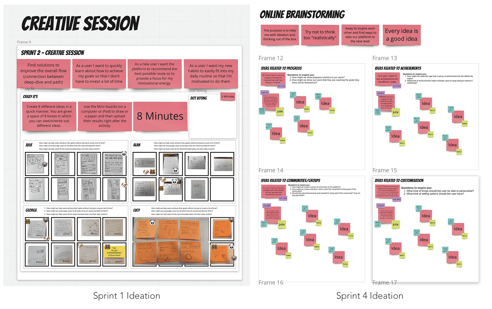
🎨 Creative Sessions: Conducted Miro-based activities (e.g. brainstorming, card sorting, cognitive mapping) to explore expectations, needs, and behaviours.
🎙️ Interviews: Semi-structured interviews focused on motivation, platform expectations, and behaviour change triggers.
🧪 Usability Testing: Iteratively tested prototypes across sprints to evaluate usability, clarity, and motivational design elements.
💬 Speak Out Loud Protocol: Used during testing and creative sessions to gain deeper insight into users’ thought processes.
Secondary Research
📖 Academic Literature Review: Books like Designing Interactive Systems and Design with the Mind in Mind informed usability and cognitive framing.
📊 Competitor Analysis: Compared successful habit-forming platforms (Duolingo, Elevate, Headspace, etc.) for functionality, flow, and motivation strategies.
🧩 Theoretical Frameworks: Cognitive Load Theory, Self-Regulation Theory, Fixed vs Growth Mindset, Motivation Control Theory, Universal Design Principles
Project Plan

Empathising
I conducted user interviews, reviewed existing research, and analyzed industry trends to uncover pain points in workplace mental health solutions.
Activities involved include:
Data Analysis of questionnaires and interviews
User Personas
User Journey Maps
See section 3.3 in my thesis document for all research conclusions.
Key Insights
Insight 1
Users felt overwhelmed by generic well-being tools that lacked customisation.


Insight 2
Most users wanted a simple, aesthetically pleasing interface with actionable, relevant recommendations.


Insight 3
A majority expressed a desire for progress tracking and community features to foster accountability.


User Journey Map
For people in the workplace to use a mental health solution, they must embark on the following path:

Design Principles
⏱️ Minimal Effort
Users should achieve goals with minimal time and effort.
🧭 Guided Autonomy
Provide flexible tools while offering optional guidance.
🎨 Aesthetic Appeal
Visually appealing designs increase perceived usability.
🤝 Community Engagement
Foster a sense of belonging through shared experiences.
🏆 Progress Tracking
Allow users to see and celebrate their achievements.
🎉 Fun Interactions
Include small, rewarding moments to encourage continued use.
Defining
Prioritising User Needs
Simplicity
Minimise effort required to engage with the platform.
Personalisation
Balance hand-holding for beginners with autonomy for experienced users.
Motivation
Incorporate rewards, progress tracking, and community features.
Design Process
The design process was split into 4 sprints, in which I would have two demos to show a solution. I broke down all the user's stories into relevant sprints and discussed with the team if they were aligned with their goals.
Once these were discussed it was the beginning of the ideate, prototype and test cycle. I will show some examples here of different sprints, but for the full comprehensive explanation please see Section 5.0 of my thesis paper.
Ideation
Brainstormed solutions based on user pain points and design principles. Explored onboarding flows, personalised dashboards, and habit-building tools.
During this phase, we also concluded that because of the context of where users would be using the platform (at work), it was important to prioritise the desktop version of the application.


Wireframing and Lo-fi Prototyping


Prototypes, Decisions and Testing Results
The design evolved through an iterative process across multiple sprints, guided by ongoing user feedback. Rather than documenting each round of changes, this section highlights the most impactful design decisions to user needs and testing results.
Simplified Navigation with Contextual Guidance
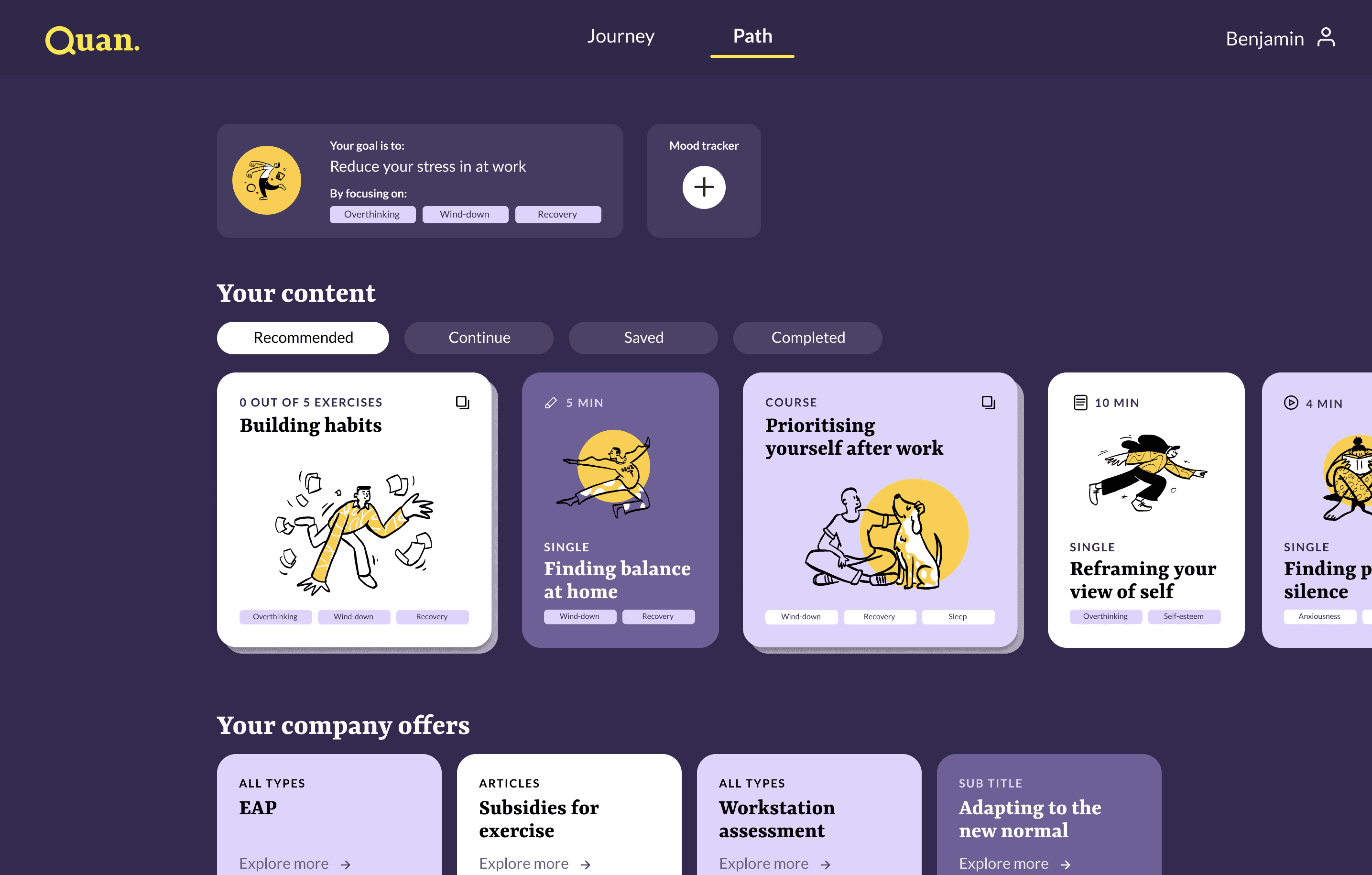
Users felt overwhelmed by cluttered pathways. I applied a persistent bottom nav bar and reorganised tasks into Continue, Recommended, Saved, and completed tabs, balancing autonomy with structure. Usability tests showed improved task completion and fewer navigation errors.
Visual Communication Over Verbal

Testing showed users often skipped text. I used shape, icon, and color distinctions (e.g., singles vs courses) to reduce reliance on reading and increase intuitive interaction.
Tailored Content Delivery
Generic wellness content was disengaging, and to respect user autonomy and different usage contexts, I introduced a dual task format: short ‘Singles’ for quick actions, and step-based ‘Courses’ for deeper engagement. Combined with the Continue/Recommended/Explore layout, users could choose their path based on motivation, time, or mood—without being locked into a single onboarding route.
Motivation Through Progress Feedback and Gamification
Many users lacked a sense of progression and achievement. To make habit formation feel lighter, I embedded gamified elements, like achievements and emotion-logging “check-ins.” Even when not fully built out, users responded enthusiastically in feedback. I added visual cues like streaks, progress indicators, celebratory illustrations, and and golden check marks to reinforce momentum. This was positively received in usability testing as “encouraging” and “satisfying.”
Project Outcomes & Challenges
Key Insights & Impact
Enhanced User Engagement
Simplified navigation and personalised features reduced onboarding time by an estimated 30%.
Improved Usability
High-fidelity prototypes tested with users revealed an 80% task completion rate for key actions.
Stakeholder Alignment
Developed a clear roadmap and presented findings to Quan’s leadership, aligning the platform’s features with business goals.
Challenges
Stakeholder Alignment
Users had diverse needs, and designing a platform that catered to both novice and experienced users risked making the interface overly complex.
Limited Time for Quantitative Research
Users had diverse needs, and designing a platform that catered to both novice and experienced users risked making the interface overly complex.
Testing in a Remote Environment
Conducting usability tests remotely via Zoom limited the ability to observe non-verbal cues and immediate reactions.
See section 3.3 in my thesis document for all research conclusions.
Recommendations
Mobile Version
Future development should adapt the platform’s core features to mobile for greater accessibility and daily habit reinforcement, when they are outside of their work environment.
Community Features
Future work could explore opt-in peer support, shared journeys, or private group challenges, designed with strong privacy settings to create a sense of shared progress without pressure.
Light Personalisation
Future iterations could include light personalisation toggles (e.g. “I prefer fast tasks” or “I’m working on sleep”) to surface relevant content without overwhelming the user with setup questions.
Test Long-Term
Run longitudinal testing (e.g. over 2–4 weeks) to validate whether progress cues, check-ins, and streaks continue to motivate users over time.
In-Person Testing
Future testing should include in-person usability tests or ethnographic-style sessions, to better capture subtle emotional and behavioral cues during interaction.
Unified Platform
Centralise everything in one platform to streamline communication and reduce administrative burden.
Contributions

Behaviourally-Driven Framework
Created a flexible structure that encourages sustainable well-being habits through autonomy, motivational cues, and behavioural design principles.
Visual-First Interaction
Replaced text-heavy guidance with intuitive visual cues, enabling users to navigate and complete tasks independently while reducing cognitive load.
Adaptive Content Strategy
Developed a dual content system and exploratory layout that adapts to users’ time, energy, and emotional context without requiring complex personalisation flows.